The Art of Adoption
Most BI fails to get adopted for the same reason no single mobile phone manufacturer has surpassed the iPhone in number of units sold. Although competitors offer similar functionality, their phones simply are not as user-friendly, at least according to the entire earth’s consumer base (if you’re an Android loyalist, don’t shoot the messenger; Apple really does produce the highest selling phone models in the world) (Bureau 2017). People like stuff that’s easy; if data is too difficult to access, they’ll take the path of least resistance and focus on whatever hits their inbox.
In other words, if your BI isn’t easy enough, your users will fail to adopt. Adoption is the key to effective BI and to creating the Dashboard Effect. Even mediocre software, if adopted, can transform your business. The best software, if users fail to adopt, can be a massive waste of resources and will have the added detriment of increasing resistance to future initiatives. Of course, the goal is to implement good systems that people use. Yet statistically, less than half of BI initiatives are successfully adopted (Gartner).
Also, for a system to get used, it also needs to be compelling. Think about your daily processes (time tracking, meeting prep, proposal writing). They all take some discipline, except one: your e-mail. Most of us have developed an attachment to our inboxes that borders on addiction, checking it compulsively and feeling a little let down when nothing new has arrived since our last fix. Why is e-mail the desk worker’s crack? Because it’s compelling. It’s current, it’s personal, and (usually) it’s relevant to the very things we’re trying to accomplish. Other people’s e-mail? Not so much. Last month’s e-mail? No.
Consider the last time you loaded the world’s greatest app onto your phone. Maybe you found a better way to assign chores to your kids, or track what you eat, or find local happy-hour deals. At first, you may wonder how you ever lived without it. Your consumer endorphins flow from the awesomeness of your new, indispensable tool (or toy?). You preach its virtues to others and insist they convert. Then, a few days later, you inexplicably stop using it. Why? Because it didn’t fit into your normal “flow” in an intuitive and compelling way.
The same phenomenon happens with dashboards.
Adoption comes down to making your dashboards easy enough, and compelling enough.
Easy, compelling dashboards require careful discovery and design.
Blue Margin’s Design Model
Making a dashboard simple and compelling enough to get adopted starts with discovery. At Blue Margin, we’ve developed a root-cause-analysis (RCA) model for designing data warehouses and dashboards. The model is nothing new under the sun. It employs established RCA principles, and it works because it fits how we think.
Using RCA successfully requires a balance of structure and flexibility. Following your gut alone will cause your goals to quickly fade in the mist as you glom onto design ideas. Make the structure too rigid, and you’ll get bogged down trying to tie every loose end. Feel free to borrow what works and leave or modify the rest, just be intentional about establishing a standard model that can be easily duplicated throughout your organization. Through trial and error and incorporating what gets to the best solutions most efficiently, this approach consistently results in solutions that get adopted, both internally and for our clients.
Tips for a Successful RCA Analysis
Keep your eye on the prize. Throughout the process, remember the purpose of root-cause analysis: to identify the simplest solution that most efficiently advances your goal. In our experience, intuition-driven solutions are almost always tragically flawed. They result in too many features to address too many proximate issues, resulting in inefficient solutions that don’t get adopted. We have found that using a framework that organizes a problem into fewer root issues leads to a more durable solution.
Keep it loose. This is a flexible framework, not a rigid formula. The trick is to stay centered on the goal you’re trying to achieve. If your goal is clearly defined, the high-level process is simple:
- Identify the problems hindering your goal
- Drill down until you get to the actionable root causes underlying those problems
- Design your solution to address those root issues
Feel free to “bend the rules.” If someone jumps to design, don’t hit the buzzer. Just make a note of the idea, then carry on with the process. If your “root issues” crisscross, overlap, or merge, don’t worry about the mess it makes. Just keep drilling down to root causes, and the picture will come into focus. Also, don’t forget to occasionally step back and make sure the overlying business goal is still in focus.
Avoid jumping to design. One of the reasons new systems fail is the human tendency to leap from problem to solution. For example, if someone at your company sounds an alarm (“We need to reduce customer churn!”) the responses will likely center on design (“We should implement better customer-service software!”) Sounds reasonable. It may seem like the self-evident solution to the problem. But there’s invariably more to the story. You’ll find the rest of the story somewhere underneath the acute and apparently all-important symptom of customer-churn. The rest of the story is revealed when you drill through to the root(s) before exploring possible solutions.
Even after you start digging, each unearthed issue will likely re-trigger the impulse to get busy applying fixes. Solution design is more about defining the goal and the issues hindering that goal than about defining features and functionality. Do the first part right and the second part will reveal itself. Again, if compelling design ideas crop up, you can always put down your shovel, make a note, then get back to digging.
Use the 80/20 filter. The brainstorming process needs to remain fluid. If you become fixated on perfection or try to evaluate the merit of every idea along the way, the process will bog down. You’ll find yourself trapped in a binary, pass/fail framework, instead of prioritizing issues on a scale and simply limiting yourself to the most critical ones.
So, feel free to write down any and every issue. Let the ideas flow unhindered, then apply a filter to separate the must-haves from the nice-to-haves. Ranking each issue from one to five (five being the most critical), then dismissing the ones and twos (and possibly the threes) will help you overcome the perfectionism trap. If you struggle to let go of lower-priority issues, console yourself with the idea that once your solution is established, you can go back and address those lesser issues (though in our experience, they’ll likely never be worth the effort). The process of deciding what’s above-the-line and what’s below-the-line is central to developing solutions that work. Try to fix everything and you’ll never arrive at a solution that’s simple enough to endure when transferred from the white board to the real world.
The 5 Steps:
Overview. In its simplest form, the RCA process starts with a measurable goal, then lists the successive issues hindering that goal until actionable roots are identified, revealing the simplest, highest-impact solution. For this paper, the RCA process is focused on dashboard design. However, the process can be applied to problem solving generally. We’ll start with a general overview, then discuss the applicability of RCA to dashboard design specifically.
1. Define the Goal (in measurable terms)
Start by defining what you’re after. This sounds easy but takes some effort. Arriving at a well-stated goal that’s “at the right level” can be tricky.
Don’t shoot for a goal that’s too lofty, nor one that’s too tactical. To illustrate, “Improve operational efficiency” is probably too high-level and vague to be useful. On the other hand, “Create a better expense reimbursement form,” sounds like a solution in search of a goal.
A better goal might be, “Decrease expense-reimbursement turnaround from five days to three.” This goal is fairly specific but doesn’t dictate a particular design. It also identifies a measurable KPI (i.e., “Average days to process expense reports”). Defining an empirical measure of success is central to designing a successful solution.
2. List the Problems
After the goal has been identified, brainstorm all the problems that most directly hinder the goal. An example problem might be, “Employees don’t fill out expense reports correctly.” It’s a simple statement that doesn’t necessarily explain “why” (answering “why” comes next).
After you’ve listed the problems, rank them 1-5 to determine which are above or below the line (our scoring methodology is described below).
3. Identify the Proximate Issues and Root Causes
After you’ve determined which problems are above-the-line, start with the most important and drill down to proximate issues and root causes for that problem. For example, a proximate issue for the above example might be, “The expense form is frustrating and confusing to employees.” Ultimately, you’re trying to drill down to the root cause of the problem, which might take digging deeper. You can get to the root by repeatedly asking why. For example, the next level of causation might be that the expense form has redundant fields, or ambiguous wording, or doesn’t account for edge-cases.
By continuing the process, you’ll drill down to root causes. In our experience, these typically show up three to five layers deep. For example, a root cause might be, “The expense form was designed from a bookkeeping perspective and doesn’t take end-users’ viewpoints into consideration.” Or, if you dig deeper, you may decide the real root is, “There is no system in place for periodically reviewing company forms for ease-of-use and applicability.” Either root might be at the right level to address. You get to decide. Here is where some flexibility and intuition come into play.
Take your time to get to the root. In the above example, it might be tempting to take action at the “problem” level by issuing a new policy penalizing employees for incorrectly filling out expense forms (“Expense forms filled out incorrectly will be returned and ineligible for processing until the next cycle.”). Rather than applying band-aids, drilling to roots will point to a more foundational solution that doesn’t just address the symptoms, for example, “Redesign the expense form to fit the end-user’s perspectives and workflows.”. By getting to root causes you’ll also fix, by extension, the overlying proximate issues or symptoms. The result will be greater adoption and better outcomes.
Once you’ve drilled down to the root cause(s) for a problem, move to the next most important problem and repeat the process. Each problem might have several proximate issues and root causes, which can seem daunting. However, problems often share underlying elements, making the process easier as you go along, similar to how a puzzle becomes progressively simpler with each added piece.
4. Assess Potential Designs
Once the roots are identified, the design should be fairly self-evident. You can evaluate the efficacy of potential designs by simply counting how many overlying causes each solves. Additionally, considering possible unintended consequences of each design will help you determine which will introduce the least risk.
The most important litmus test for the viability of a possible solution is assessing how efficiently it will advance the KPI(s) defined in the Goal. Also, consider how difficult it will be to track those KPIs. Is the performance data a byproduct of normal workflows, or does it have to be separately entered? If the data is already in a transactional system, how accurate is it, and how difficult to retrieve? At Blue Margin, we won’t adopt a solution unless it’s worth putting on a dashboard. So, if the cost of acquiring the data to measure progress is not outweighed by the value of solving the problem, the proposed solution doesn’t make the cut.
5. Execute and Evolve
Keep in mind that that every design needs room to evolve. Even after carefully following the BlueCore process, your solution will require iteration before it’s running at top-speed. It will also need periodic review to adapt to your evolving business. Keeping KPIs front-and-center will naturally drive that evolution. In other words, if you show employees empirically (and in pictures) how they’re performing against goals, you’ll harness the strategic problem-solver in each of them, and they’ll naturally adjust as they go.
That said, minimizing course corrections before you launch will greatly increase the likelihood of adoption. End-users will become quickly jaded and will reject new systems if they encounter too many hurdles out of the gate.
RCA and Dashboard Development
Since adopting the RCA model, we’re consistently amazed at the number of sophisticated businesses who suffer with poorly adopted reports and dashboards that were designed by intuition, rather than a structured process. Often, companies falter at the very first step: defining the goal. This mistake sets a bad trajectory for the rest of the design process, leading to an accumulation of features and functionality that poorly support the goal.
To define the goal(s), ask yourself the following questions:
- What are the company’s top three opportunities? In other words, what is most exciting about the business currently?
- What are the top three business problem the company is currently trying to solve? In other words, what keeps executives up at night?
- What are the most critical activities, by role, that affect the company’s success?
- What critical decisions are made on a daily/monthly/quarterly basis that most differentiate the business and make it successful?
- How do executives, the management team, and employees maintain focus on the right decisions and activities?
Execution comes down to decisions and actions, so focusing on which decisions and actions are most important is the right place to start when thinking about developing dashboards. It can be tempting to create a laundry list of metrics and reports that sound like the typical information a company should care about, or that include the same data as the reports you currently use. Instead, we recommend setting those ideas aside and thinking about how you measure your company’s success on a daily basis.
Then, simply follow the RCA model. Ask yourself what most hinders a given goal. If the goal is to double sales, fearlessly call out every issue that hinders that goal, without regard to how significant the issue is, or how seemingly insurmountable. Don’t be afraid to invite the elephants into the room. If the obstacle is daunting (i.e., “We’ve tried everything we can think of and are out of ideas”), continue working your way through the process and you’ll be surprised at how many viable solutions present themselves. For example, the answer to the above issue might be to bring in a consultant.
Once you’ve drilled down to root causes (e.g., “We don’t accurately incentivize our salespeople to focus on the right activities.”), you can begin to design your dashboard. This is where KPIs do their magic. Keep in mind the axiom what gets measured, gets managed. If you design a solution but have no means of measuring its effectiveness, you’ll be back at the same table addressing the same issue soon.
For KPIs to have value, they must be high impact. In other words, creating countless spreadsheets, charts, graphs, and PowerPoints is not the key to changing behavior. The key is to find those few measurements that really touch a nerve and drive performance. To find them, consider which metrics measure the activities that produce results, rather than those that measure the results themselves.
For example, “Closed Sales Per Month in Dollars” is a precise measurement of outcomes, but to change behavior, you should put a spotlight on the activities that produce those outcomes. Choosing KPIs that measure downstream results such as Closed Sales can be difficult for employees to take ownership of, which will limit motivation.
Blue Margin dashboard with KPIs. Source: Blue Margin Inc. Internal Graphic
In our experience, KPIs should measure activities that are as close in proximity to the desired result as possible, while remaining largely under employees’ control. “Number of Dials” might seem like a good sales KPI because the employee has near-perfect control over it. However, depending on the business, dials might be the farthest point in the sales process from a closed deal, and therefore may be a poor indicator of performance.
Additionally, measurements like dials are high in volume and are therefore difficult to audit. Validating each dial is impractical, making it easy to game, even if subconsciously. After all, what constitutes a dial? Do misdials or wrong numbers count? How about leaving a message? What about leaving a message at the same number twice in one day? Moreover, if KPIs are tied to activities that predict outcomes poorly (i.e., Dials), employees will have little motivation to push for the end-goal (i.e., Closed Sales).
You might argue that placing careful parameters on what constitutes a dial would solve the problem. However, the more complicated the “rules,” the higher likelihood of confusion and poor adoption. Alternatively, you might argue that additional KPIs could be added to motivate the employee to advance the sale, but adding too many KPIs can be equally problematic, creating complexities that cross the threshold of diminishing returns. For dashboards to take hold, simplicity is essential.
Going to the other extreme, one might decide to measure the number of proposals generated per salesperson, an activity with a high correlation to sales outcomes. The problem with this level of measurement is that the employee may have little control over the results on a day-to-day basis. The likely result is that employees will be discouraged rather than motivated by the pressure to perform, because their ability to impact the KPI is too limited.
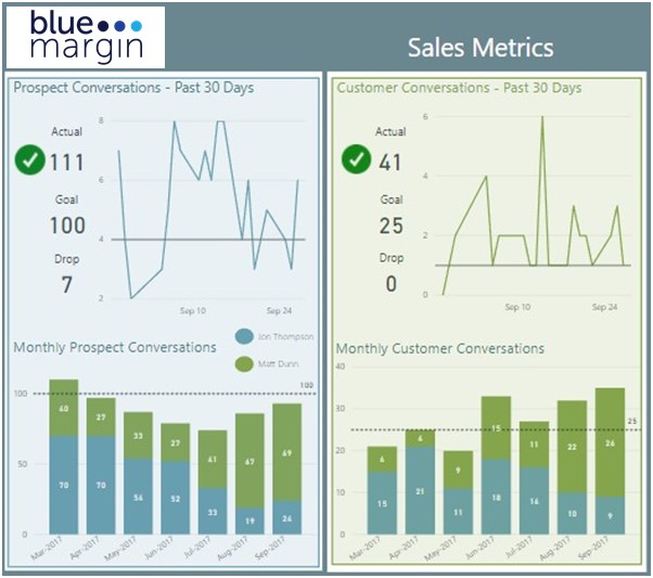
Instead of “Proposals Generated,” a good KPI might be “Sales Conversations.” Each Conversation would represent an exchange between the salesperson and a prospective client that moves the process along (one way or the other). Sales Conversations is an activity reasonably within the employee’s control, yet with a strong correlation to closed sales. Moreover, KPIs such as “Sales Conversations” are auditable. That is, they are few enough in number (maybe three to five per day) and have defined attributes (e.g., With whom? When? What was discussed?) such that a manager can review and qualify the data behind the KPI.
Ultimately, identifying the right KPIs is often the solution itself. In other words, rather than implementing new systems or processes, simply providing visibility into the right metrics will drive the right activities.
Design Elements for Dashboards that Get Adopted
Easy and Compelling = Adoption. Through trial and error, we’ve identified five (and a half) characteristics that make the difference between dashboards that get ignored and those that get used consistently over the long haul. These standards will determine if your reporting is mostly noise or truly compelling and easy enough to take hold:
- Mission Critical. First and foremost, for BI to succeed, it must include only the salient stuff. It should touch a nerve. In other words, if the graph, chart, report, table, or KPI (key performance indicator) doesn’t compel you to pick up the phone, call a meeting, make a buying decision, shift your focus in some way, or confirm your course, don’t include it in the dashboard. Push it to the future (the waaaay distant future). Otherwise, once your data is organized and in one place, you’ll give into the temptation to believe that more equals better (“While we’re at it, let’s include this metric. It might come in handy.”). There’s your red flag. If the best reason you can give for adding a piece of information to a dashboard is, “It might come in handy,” or “It’s informational,” odds are it should be relegated to your sandbox dashboard (the one that scratches an itch, but never gets published). The more you water down your BI environment with nice-to-haves, the less compelling it will be to users, and the less likely they’ll come back. Ask yourself, What action will this graph trigger? What decisions will it force? If the answers aren’t clear, set it aside. With dashboards, less is more.
Consider the following scoreboard:

Baseball scoreboard. Source: Wikipedia Fair Use.
Even though baseball is a breeding ground for obscure statistics, the above scoreboard displays only the critical information players and fans needs to understand exactly what’s happening right now. Every number on the board touches a nerve.
- Contextual. Context brings your data to life. My daughter recently asked me to guess how many geese she saw at the park that day. I said, “I don’t know. How many?” Her answer? “A lot!” To a five-year-old “a lot” could be four or four hundred. Hard to know without context. Presenting the numbers to your audience might make them feel more informed, but it may not trigger the behavior change you’re looking for. If you tell the executive committee that the company website received 1.2 million hits last month, it may raise their eyebrows, but they won’t know what to do with it. If, however, you tell them that the 1.2 million views were an increase of 70 percent over the same period last year and three times the average for companies in the industry, and sales increased correspondingly, and the company only spent $1,000 in paid-placement ads prior to the upturn, their response will more likely be, “Why the heck aren’t we spending more on paid placement!!??”
One of the most effective means of providing context is with Key Performance Indicators, or KPIs. KPIs alert users at a glance to areas of opportunity and risk. KPIs put a spotlight on exceptions in the data and tell a story without requiring the user to study the data. Here’s an example of two graphs: one with just the numbers and one with context. Which is more compelling to you?
Limited Context:
Dashboard without context. Source: Blue Margin Inc.
Lots of Context:
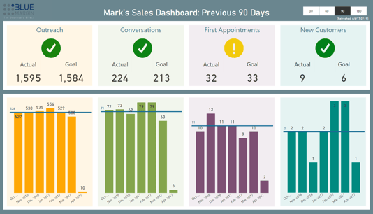
Dashboard with key performance indicators. Source: Blue Margin Inc.
The first requires study (and a magnifying glass), and the second calls your attention to a potential issue (“First Appointments”) in an instant.
- Highly Accessible. Like the dashboard in your car, your data needs to be heads-up and dead simple. If determining your driving speed required logging into an app and doing mental calculations, you’d probably resort to driving by feel and reacting to whatever comes your way. In our experience it takes very little friction to cause people to backslide from being data-driven to being reactionary. If the insights your employees need aren’t as easy as grabbing a smart phone and checking the scoreboard, they won’t adopt. They’re too busy keeping their heads above water to take on more mental overhead. It’s much more effective to send employees a daily digest of KPIs via e-mail, or post “instant-impact” dashboards on TVs around the office, or set the default tabs on their web browsers to show the same (or even better, all of the above).
- Real Time. Keeping your dashboards as current as possible is important for the same reason that yesterday’s newspaper is used for starting fires, and today’s is fought over at the breakfast table. Why are last year’s top-of-the-line golf clubs considered obsolete (though they were hailed as the pinnacle of engineering when they came out), and this year’s, though virtually indistinguishable, are considered state of the art? People are drawn to what’s new. A postmortem view of last month’s sales is a chore to digest. By comparison, the success rate of sales calls made this week is exciting. Keep it fresh, and users will consistently come back for the latest update.
- Graphical. Unless you’re an accountant who reads numbers like the rest of us read English, graphs are easier to understand than tables. When it comes to data, pictures are truly worth a thousand words (or data points). Although most of Blue Margin’s clients already have access in some form to the data they need, once their data is displayed graphically, they invariably respond more viscerally (“I can’t believe we’re spending that much time on approving purchase orders!”). A recent University of Illinois study identified a similar phenomenon through the use of nutrition labels. The study found that consumers are more likely to make healthy choices when presented with a simple, two-dimensional graph rather than when presented with a typical nutrition label in which voluminous and undifferentiated text is crammed into a small space (University of Illinois: College of Agricultural, Consumer and Environmental Sciences 2016). Similarly, a Wharton School of Business study found that 67 percent of audience members are persuaded by verbal presentations with accompanying visuals, versus 50 percent by purely verbal presentations (Ashton 2015).
Maps are a perfect example of why graphical information has more impact than just the numbers. For instance, if you’re given a set of tables showing the production of natural gas by county and volume over time and asked to determine where the state should consider investing in infrastructure, it might take hours or days to form an opinion. See that same data on a map, and it instantly tells the story.
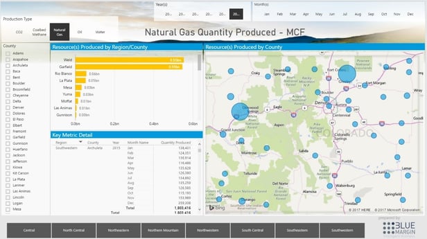
Colorado Oil and Gas Conservation Commission Interactive Map. Source: Blue Margin Inc.
Similarly, if on the one hand you’re presented with your company’s sales figures for the past six months and asked to determine sales outcomes going forward, you’d have to hunker down for some analysis. A regression graph, on the other hand, delivers instant insight.
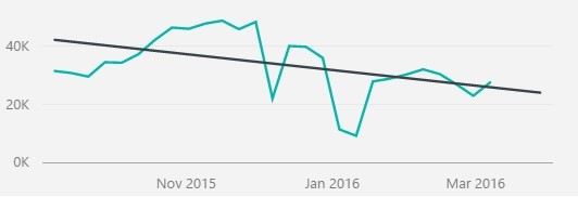
Dashboard conveying sales progress with regression line. Source: Blue Margin Inc. Portfolio Work
People prefer pictures over raw data the same way they prefer stories over facts. We like stories. Stories stick. And for most of us, pictures tell stories better than numbers do.
- Interactive. In the same way that graphical information engages users, enabling users to interact with the data increases the likelihood that they’ll adopt. The touchscreen was a key feature that led to the meteoric success of tablet computers—it was tactile and interactive. The ability to interact with information creates a sense of both exploration and control. For computers and handheld devices that ability was revolutionary; now it’s expected. We’ve all become like toddlers in a baby activity center. Give us some knobs and noisemakers, and we’ll want to keep playing.
By contrast PowerPoints and PDFs have become synonymous with nap time. If you want your audience to stay awake and keep coming back, give them something to do. A good dashboard, one that gets adopted, should intuitively invite the user to explore (and maybe even have some fun).
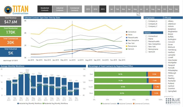
Interactive Construction Project Dashboard. Source: Blue Margin Inc.
Dashboard Discovery Questions:
RCA Goals Discovery
To define the goal(s), ask yourself the following questions:
- What are the company’s top three opportunities? In other words, what is most exciting about the business currently?
- What are the top three business problem the company is currently trying to solve? In other words, what keeps executives up at night?
- What are the most critical activities, by role, that affect the company’s success?
- What critical decisions are made on a daily/monthly/quarterly basis that most differentiate the business and make it successful?
- How do executives, the management team, and employees maintain focus on the right decisions and activities?
- Is there a competing (or already failed) parallel BI project in-house?
- Tell me about it…
After identifying the goals, follow the RCA process to find actionable root causes. In addition to the RCA process, the following tactical questions and worksheets will help round out the business requirements for the dashboards.
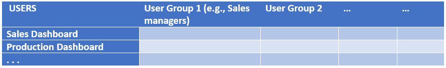
Stakeholder Discovery
- Which people will interact with the reports or dashboards?
- what are their roles?
- what are their business goals? How will the reports and dashboards enable them to achieve their goals?
- what are their interactions (e.g. consume report content, approve content, supply content, etc.)
- Which groups of people should see which reports? What’s the hierarchy of access?
- In what ways does the current system fall short of meeting their information needs?
- Whose performance will be measured?
- Who is responsible for the performance being measured?
- Who provides accountability for the performance being measured?
- Who will consume the dashboards (different groups/classes of users) and what is each of their purposes in viewing each dashboard?
- What questions should the dashboard answer? What actions will be taken in response to those answers?
- How will the dashboard make the user more successful in meeting his responsibilities?
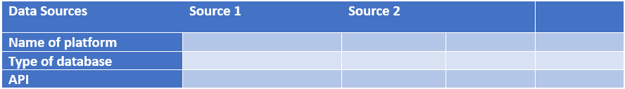
Outputs Discovery
- Specific visualizations? Custom visualizations? Matrices and tables?
- Slicers (per department, area, category, etc?), or are there cases where you need 1 tab per pre-sliced view?
- How often do reports need to be refreshed?
- How performant do you need your reports to be? (< 2 seconds per slicer click? 3 mins for certain difficult items?)
- Delivery method?
- PBI Portal?
- Scheduled email?
- SharePoint?
- Custom web page?
People / Roles Discovery
- Do your people want to “learn” Power BI and DAX… in depth? Lightly? None?
- How about building reports – Blue Margin? Your own resources?
- If training is desired, will you want that to be on-site?
Worksheets
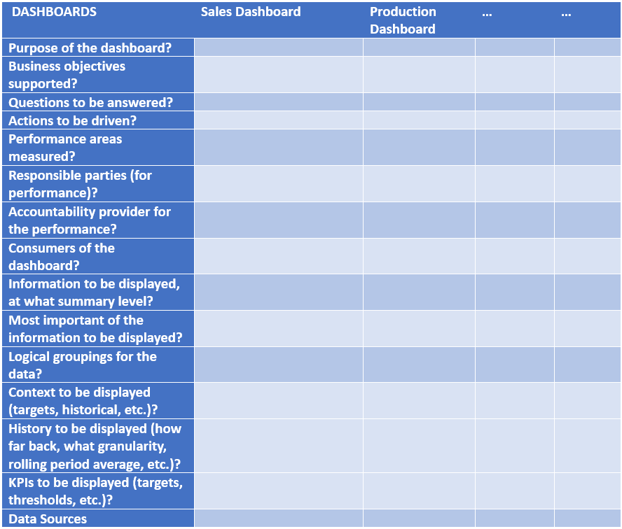
Questions to Vet a Proposed Dashboard Design:
Once a dashboard or wireframe is developed, it pays to do a final vetting before putting it in end-users’ hands.
- What is the take-away for this dashboard?
- Who is the audience?
- What decisions does it trigger?
- What actions does it drive?
- Is it “just informational”? That’s a red flag. It needs to drive decisions/actions.
- What performance areas will be improved?
- What KPIs and measures indicate performance?
- What is the status of those KPIs and measures currently (even if subjective – e.g., “our Sales productivity is currently a C+”)?
- What is the desired end-state of those measures and KPIs?
- What is the story? What is the user’s journey that the dashboard facilitates?
- E.g., “I’m the business owner. I want to minimize inventory…”
- Does the dashboard track with users’ natural process for gaining awareness, performing analysis, and taking action?
Additional Guidelines for Successful Dashboard Design:
- The greatest value is simply bringing data together in a way that is easy to consume (i.e., don’t over-engineer; simple, critical information is best).
- Shifting time from the build phase to the planning and wireframing (i.e., “storyboarding”) phase produces better results, faster.
- Don’t start building a report until you have wireframes completed and reviewed with stakeholders and at least one end-user.
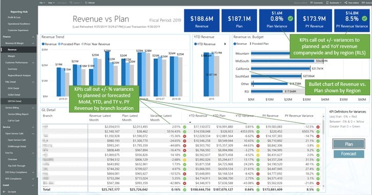
- Structure reports in the order of Awareness, Analysis, and Action. Follow the natural flow of reading (left to right, top to bottom). Start with key metrics across the top and the trend against goal for the key metric you’re trying to address (Awareness). Break down the key metric into the most helpful dimension(s), such as Sales by Region or by SalesRep (Analysis). Then provide the detail needed for the user to take action, such as Accounts at Risk (Action). See example below.
- Consistent page structure dramatically improves ease-of-use and adoption (e.g., consistent logo, refresh date, and slicer locations; similar types of info in the same quadrants; etc.).
- Use simple, descriptive page titles.
- Place slicers on the right-hand side of the page; try to answer the most immediate questions at the top of the slicer stack.
- Add the company logo in the upper-left corner of the page.
- Shoot for a maximum of 3-4 main visuals per report. Less is more.
- KPI’s should be prominent in the design. Provide strong visual clues on performance (e.g., green checkmarks, red X’s).
- Don’t use KPI colors in other visuals. For example, if green is used for good and red for bad, don’t use them in a bar chart unless they add to the insight.
- Similarly, colors should be used with a purpose. Arbitrary coloring may look nice, but will add to the visual complexity unless consistently used with intent (e.g., green is always positive, red is always negative).
- Minimize “digits on the screen”.
- For example, if $1.9M does the trick, don’t show it as $1,912,543, or if 24% conveys the information needed, don’t show it as 24.32%.
- Power BI Specific:
- Keep text consistent in terms of font, size, and color. For visualization titles, use a larger font than the default.
- Use snap-to-grid (make sure to turn it on when first creating reports).
- Everything should line up and be distributed in a pleasing and consistent way.
- Don’t get too creative with background colors.
- If using grey, avoid transparent visual backgrounds (produces “muddiness”).
- At least consider using a white or “cleaner” background.
- Wrap drop-down slicers in a consistent color so that it’s easy for the user to differentiate them from visualizations (especially cards).
- Consider using “dynamic text insights” where appropriate and helpful.
Sample Dashboard (Awareness — Analysis — Action)