The Pitfalls of Planning Your Power BI Dashboards Backwards
Companies struggle with converting data into a valuable business asset due to the lack of technical and business resources. It generally starts as a business-driven initiative, such as:
- How do we improve our order-to-cash efficiency?
- How can we get our A/R agents to take more ownership of DSO goals?
- How can we make sales managers and their reps more accountable for cross-selling and upselling opportunities?
Meeting business objectives then requires identifying the leading KPIs (key performance indicators) to drive accountability toward results. Then comes mapping those KPIs to the personas who own the responsibility and can have the most impact on them.
The result is a set of business requirements for reports and dashboards that will improve visibility and business outcomes.
The technical requirements are a function of the business requirements and include data sources, data model, infrastructure, performance, and security, but companies often make the mistake of relegating their BI initiative to the IT department. The ensuing technical work can quickly get out of step with the business objectives. Critical best practices don’t rise to the top, including:
- Designing reports that “touch a nerve”
- Training and supporting end-users to ensure report adoption
- Mitigating report proliferation
- Maintaining report quality and reliability
The result is that those few companies who make a concerted effort to mobilize their data report anemic results.
Real Private Equity Business Intelligence Examples
In other articles, we’ve outlined the basics for how PE firms and their portfolio companies can use data lakes and lakehouse architecture to mobilize their data for better performance and higher valuations.
The following Power BI examples demonstrate how several mid-market companies were able to harness their business information executing a buy-and-build strategy.
By centering on business outcomes first, they turned their data into a high-value asset that drives performance.
Power BI Example #1: Healthcare Company With Multiple Regional Clinics
Several issues hindered growth and profitability for this healthcare organization:
- Revenue consistently fell short of expectations across the organization, with no clear insight into root causes or areas of needed improvement.
- Information was decentralized and mostly distributed via spreadsheets, resulting in inefficient manual effort, high risk of error, inconsistent action plans by management, and low adoption.
- Employees only marginally understood their Revenue Cycle Management Model, causing operational and procedural errors, along with unknown pathways to success.
- Poor insight into the impact of rate- and code-changes was making negotiations with payers and forecasting difficult.
In response, the following reports were developed by our Microsoft Power BI consultants:
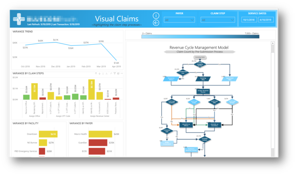
Visual Claims Report
Key Features
- Clear indication (via KPI) of greatest variance by RCM (Revenue Cycle Management) step.
- Heat-mapped flowchart illustrating which steps in the revenue cycle cause the most draw-down.
- From contracted rates to actual payments, pertinent info is grouped by procedure code, payer, and facility.
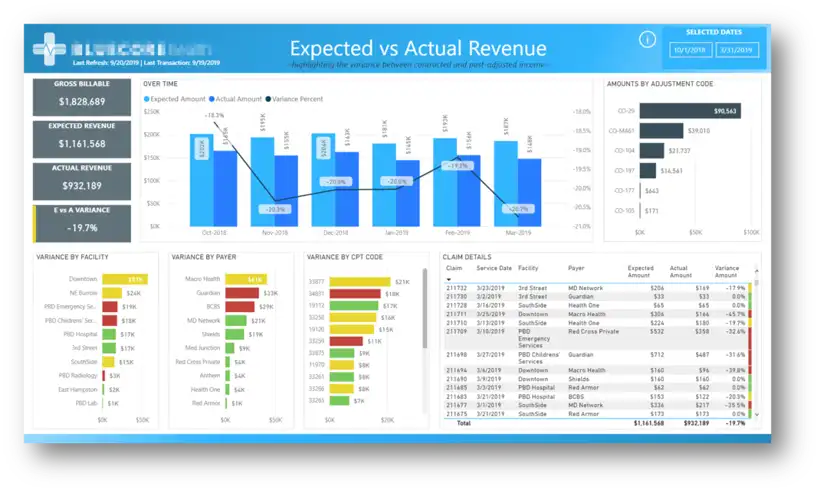
Expected vs. Actual Report
Key Features
- Clear indication (via KPI) of greatest variance between Expected vs. Actual revenue by claim step, facility, and payer.
- List of transactions filtered by variance and sorted by magnitude to produce highest-value lists of revenue opportunities.
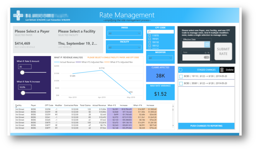
Rate Management Report
Key Features
- Dynamic, multi-variable, what-if analysis to forecast the impact of proposed rate changes.
Benefits
Thanks to the straightforward ranking of transactions and transparent visual markers of revenue-impacting problems, the company could concentrate its resources on the most lucrative initiatives and bridge the gap between expected and actual results.
- Revenue variance and shortfalls improved with the ability to clearly identify sources of variance at the process step, facility, and payer level.
- Operating efficiency increased and errors decreased with the development of operating guidelines and procedures based on highest-impact variables.
- Because of clear depictions of the Revenue Cycle Management Model, Standard Operating Procedure compliance increased through employee use of the heat-mapped, revenue-cycle flowchart
- Profitability Increased through code optimization and payor negotiations, as enabled by the Rate Management report. With the included what-if analysis, management was able to calculate the cost/benefit equation of proposed payer terms.
Power BI Example #2: Manufacturing company
Although a very different industry, this company shared similar frustrations around poor visibility:
- Executive Leadership and Plant Managers had poor visibility into whether orders were going out on time across the company and from individual plants.
- Divisions and locations had developed disparate data “camps” and varying calculations for the same performance metrics. This made it difficult to aggregate and compare performance and created inefficiencies due to operational silos.
- Plant managers needed better visibility into their backlogs in order to maintain consistent production by coordinating the job queue.
We started by addressing the low-hanging fruit. Initially, delivery performance, an issue to which their bottom line was particularly sensitive.
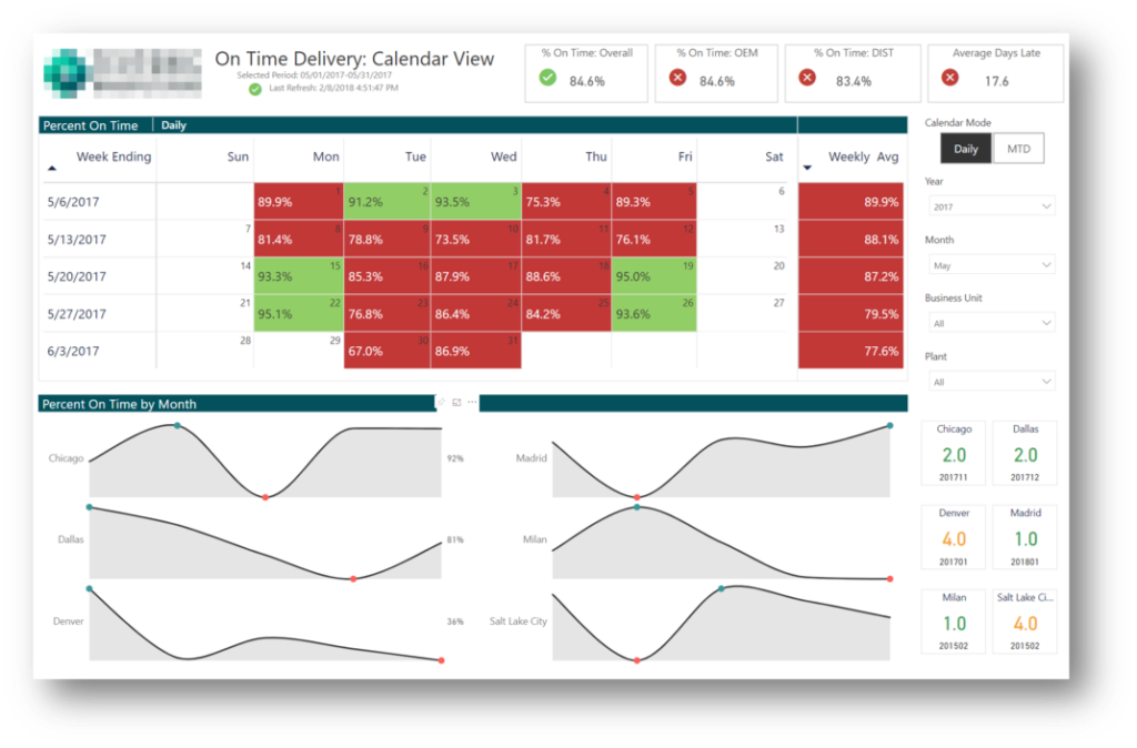
On Time Delivery Report
Key Features
- Calendar view with clear indication of OTD (on-time delivery) performance to goal by day and month-to-date.
- Trend lines to identify production patterns and trends by location.
- Increased competition across plants via the “Highest Ever Rank by Date” visual.
- Ability to filter by year, month, business unit, and plant.
Production Efficiency Report
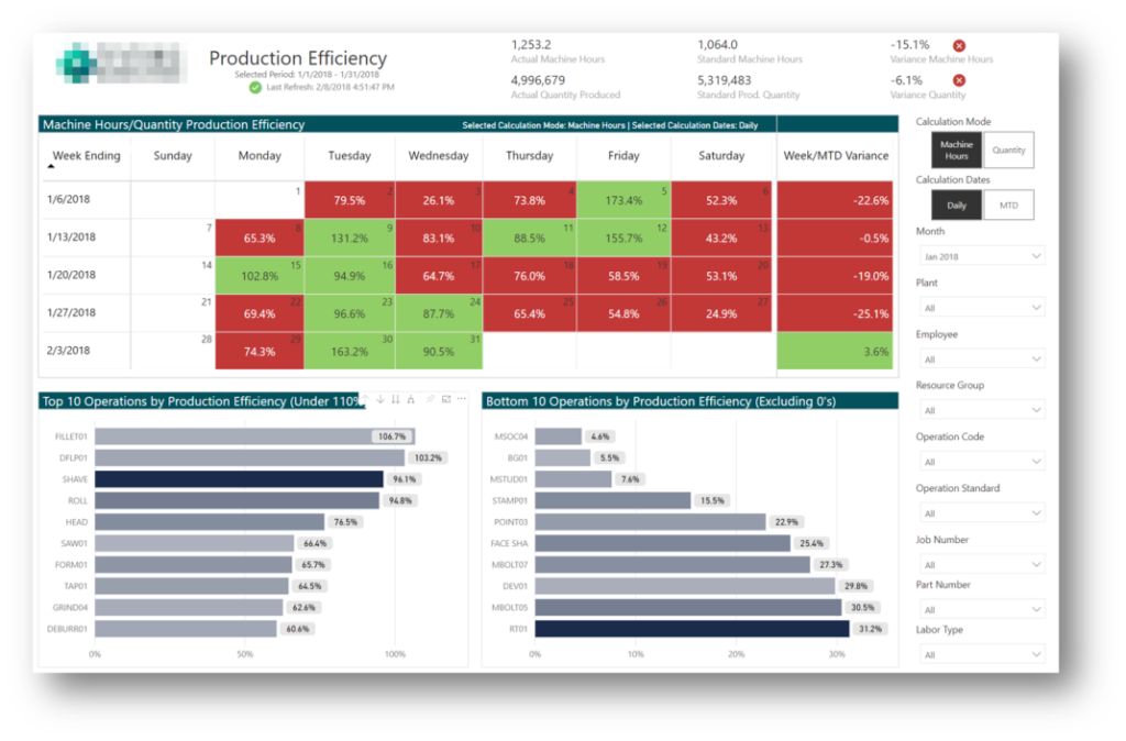
Key Features
- Calendar view with clear indication of production performance.
- Bar charts to clearly identify top and bottom performing areas of the operation by production efficiency.
Employee Utilization Report
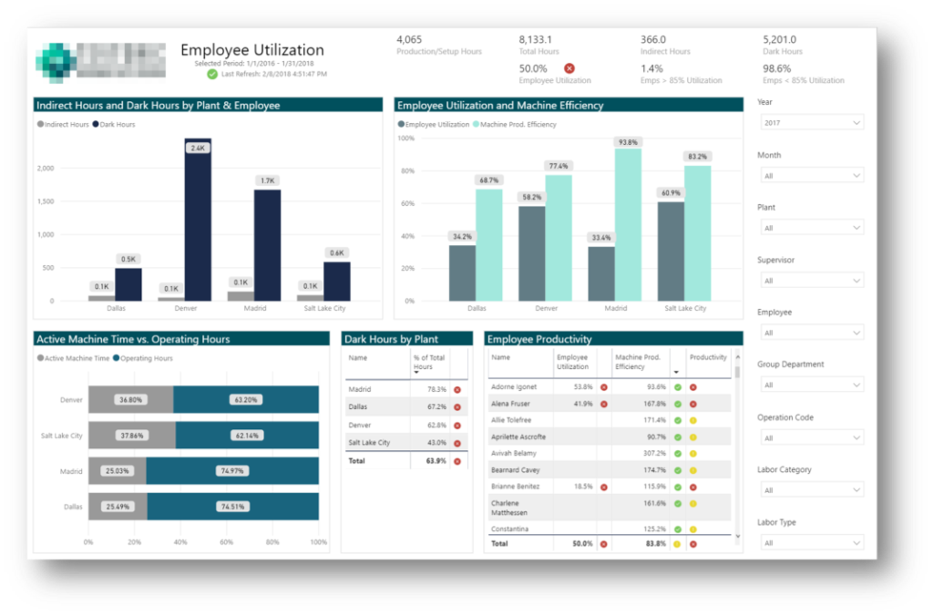
Key Features
- Visual indicator of machine utilization as a function of operating hours, standard machine-hours, actual quantity produced, and standard production quantity, with variance metrics for each.
- KPI and ranking of employee productivity in terms of time and machine utilization.
Benefits
For the first time, management gained a normalized view of on-time delivery and employee/machine utilization across plants and up to the current day.
- Employee productivity and machine utilization improved with real-time updates on how they were performing against goals, and their peers.
- Management efficacy improved as managers were able to coach employees on addressing performance gaps based on empirical feedback, rather than reacting to the latest issue or micromanaging.
- Automatically generated dashboards delivered clear visibility into consistent and timely performance metrics.
- Shipping staff improved order delivery times due to increased, measured accountability to goals, and a clearer sense of direction from internal benchmarks across locations.
- Profitability increased by identifying under-performing locations through a comparative analysis of divisions, enabled by the normalization of measures across systems.
Power BI Example #3: Manufacturing Company
Another manufacturer we worked with leveraged business intelligence to address issues related to margins and P&L trends.
- Management struggled to control material costs and maintain margins.
- They lacked granular insight into margins at the parts level and were unsure where changes needed to be made.
- Executives lacked clear insight into P&L trends and had little ability to perform comparative analysis versus prior periods.
To solve these issues, reports were created to provide clear margin analysis, with drill-down to the individual part level, and to accurately highlight trends across the P&L.
Material Margin Analysis Report
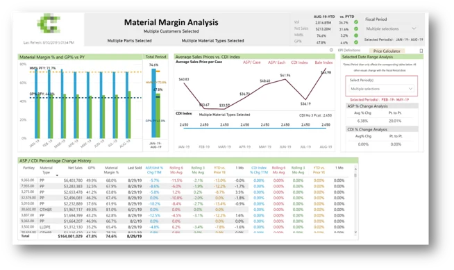
Key Features
- Comprehensive visibility into material margins and gross margins.
- Clear indication of relationship between material costs and margins.
- Ability to drill down to customer and part levels using report slicers.
Profit and Loss Report
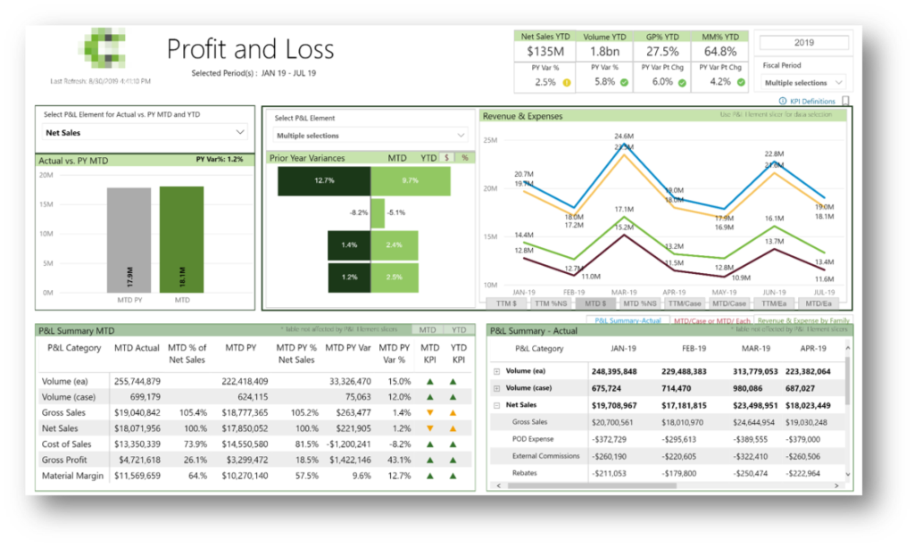
Key Features
- Multiple levels of analysis, including monthly, MTD, and YTD with ability to compare current year to previous year for each.
- Phase-switching for eight key metrics, including: TTM per case, TTM per each, MTD actuals, and MTD % of net sales.
Benefits
- Management improved margins by optimizing COGs at the part level.
- Material margins and gross margins improved through better cost control.
- Overall profitability increased with leadership’s ability to perform trend and comparative analysis across the P&L.
Power BI For Private Equity Key Takeaways
Business Intelligence is now more accessible than ever as a way for private equity firms and their portfolio companies to get a read on how to truly move the needle. As illustrated by the above examples, when companies rationalize their data, they develop a functioning toolset capable of transforming the organization and accelerating growth (aka digital transformation). By centering BI initiatives around business outcomes first, organizations can overcome the common pitfalls experienced by others, and turn their data into a high-value asset.
Connect with us to learn more about private equity analytics or complete the form below to let us know you’d like to see additional industry-specific dashboards that measurably improve business outcomes.


