


Fact: The difference between dashboards that just “look good,” and those that get adopted is subtle.
More Important Fact: The impact of “pretty” dashboards vs. dashboards that get adopted is all the difference in the world.
Designing dashboards that touch a nerve, that change behavior, and that improve performance – from the CEO down – is both an art and a science. And, if you know anything about our approach to designing dashboards that move the needle, you know it comes down to ADOPTION.
What happens if you get your people to use dashboards?
If you can get your people to use dashboards, you’ll see more focus, activity, and (dare we say) happiness at work. Visibility empowers people. It’s like giving sight to the blind. It establishes reference points, a scoreboard, pitches along the route to the top. In 20 years of entrepreneurship, we’ve never seen a more effective management tool than dashboards.
The truth is, if your data isn’t doing these things in your organization, you’re falling behind in business. Don’t let the best raw material for overhauling your productivity and profitability trail away like exhaust in your rear view mirror.
And while data analytics and dashboards are arguably the quickest, most effective way to transform your operation, the hard reality, the unspoken secret in the industry, is that less than 30% of data projects achieve their intended goal (Gartner). In other words, they fail to get adopted. In our experience, even mediocre dashboards that people use, make a big impact.

How do we create dashboards that people actually use?
To help you defy Gartner’s odds, we’re revealing our “secret sauce” for creating dashboards that people actually use every day, over time.
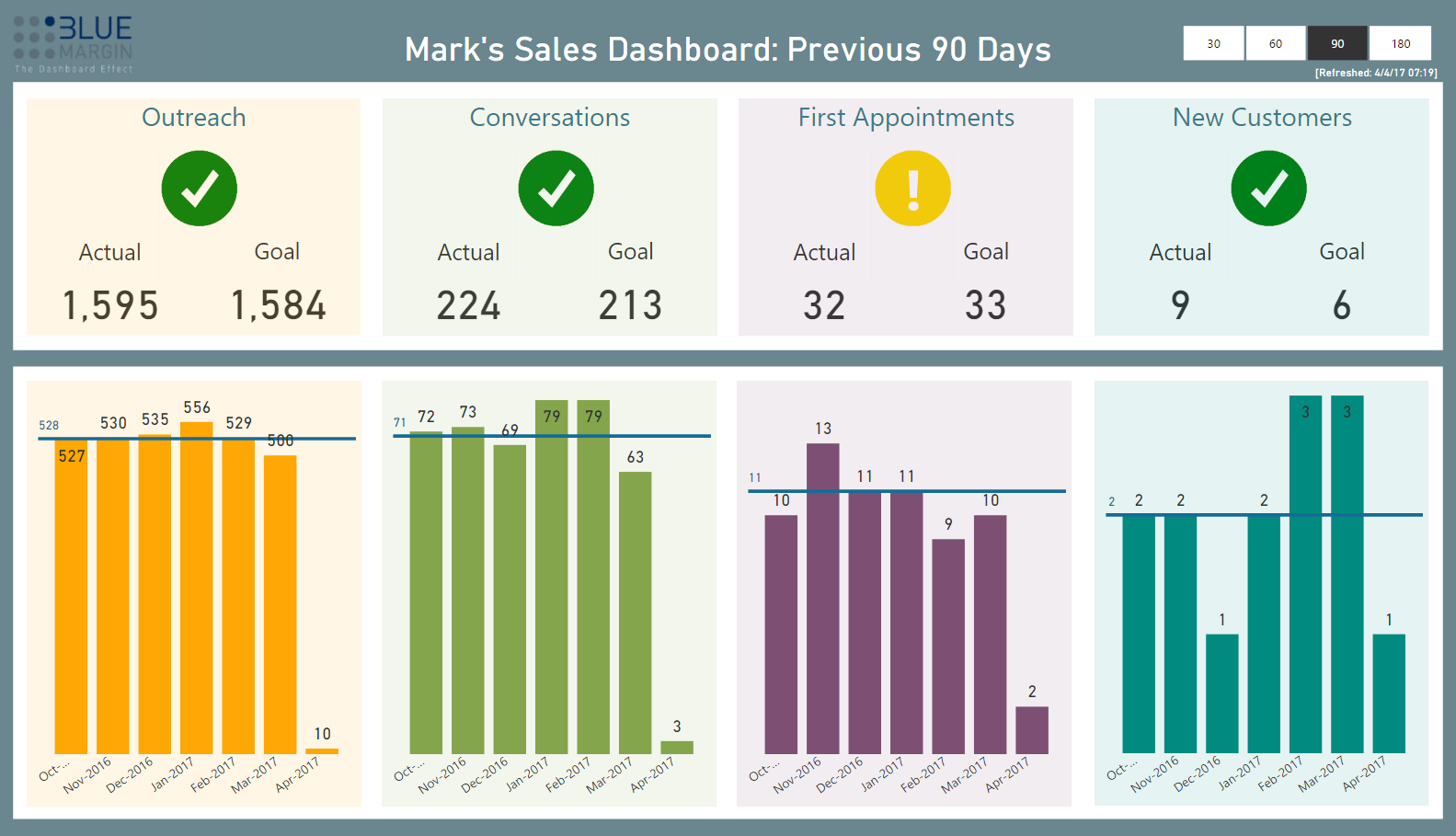
1) Dashboard data should be easy to consume.
Raw data is complicated. If it can’t be rendered into easily consumed, bite-sized pieces, it won’t get used. Why? We’re too busy. If consuming data requires requesting multiple reports, exporting data to Excel, mashing and manipulating, forget it. If you have to “re-learn” the purpose of a dashboard each time you look at it, you won’t. You don’t have time.
Start by using simple, intuitive page titles, with no more that 3-4 main visuals per dashboard. Eliminate all the nice-to-haves. Only include the data you need to survive and grow (and if you must, put the rest in a “sandbox dashboard” you can revisit later. Or never).
Our rule of thumb? If your 12-year-old can look at your dashboard and understand what’s going well and what’s not, you’ve nailed it.
2) Dashboard data should tell a story.
Tell a story that follows how the user thinks. Put yourself in their shoes: “I’m the business owner. I care about A, B, and C. Sometimes I wake up worried about X. I’m most excited about Y . . .”. Then look at your dashboard, and see if it fills in the blanks successfully. If it leaves follow-on questions unanswered, that’s not good. Or if it includes information that has nothing to do with A, B, C, X, or Y, that’s also a red flag. Start with the highest level, most important data in the upper left, then tell the story top to bottom, left to right.
Any easy way to tell a good story is to include 3 types of data visuals: High-level status (e.g., Your aggregate Accounts-Receivable RAG status) , Trends (e.g., Your total aging receivables compared to the same period last year), and Context (e.g., Your receivables by 30, 60, and 90+ days). Also, sometimes a table of the granular data will help complete the story.
3) Dashboard visualizations should be consistent, always.
Every dashboard, across every department, should use a consistent structure and design. Dashboards for engineers should be readable by marketers and accountants. Refresh dates, drill-downs, and slicers should all be in consistent quadrants. Colors should be used with intention, NOT just to make dashboards pretty. Pretty colors are nice, but they’re often noisy and can crowd out the critical message.
4) Font, white space, and icons make an impact.
Clean, easy-on-the-eyes design is universally appreciated (thanks, Apple) and by default is more likely to be adopted. We all want to interact with technology that feels good, looks good, and creates a sense of Zen.
At Blue Margin, we maintain a tribal list of dashboard “Commandments” (that’s what we call them). They’re essential to ensuring our dashboards get adopted (because it turns out that intuition isn’t a great guide when it comes to successful dashboard design). Here are a few:
- Titles should be large, simple, and consistent across reports.
- Minimize digits on the screen. If $1.9M does the trick, don’t show $1,912,543.
- (In Power BI) If you can use graphics instead of numbers, do it.
- Accompany critical metrics with icons; they provide easy visual clues about the purpose of numbers.
- Don’t use KPI colors in other visuals. For instance, if green is “good” and red is “bad,” don’t use the same colors in a bar chart, unless the meaning is the same.
- (In Power BI) Wrap drop-down slicers in a consistent color to make it easy for the user to differentiate them from other visualizations and scorecards.
- Consider page backgrounds carefully – default to a white or similarly clean background. If using grey, avoid transparent backgrounds on your visuals (or they’ll get “muddy”).
Our list of “Commandments” for increasing adoption goes on. We’ll share more soon.
If you’re interested in learning more about how to build dashboards in Power BI that get adopted, get in touch. We’re happy to share more about how we consistently achieve 90%+ adoption among client-companies.