How to Create Power BI Dashboards That Get Adopted
The difference between a Power BI dashboard that looks good and one that actually gets used is subtle in design but enormous in impact. A dashboard that nobody opens does not improve performance, regardless of how accurately it reflects the underlying data. Adoption is the whole game.
In twenty years of building dashboards for mid-market companies, we have found that even a modest dashboard that people check every day outperforms a sophisticated one that gets ignored. The question is not how to build a better dashboard. It is how to build one that becomes part of how people work. The principles below are what we come back to every time, and they are covered in more depth in our dashboard design guide.
Four Principles Behind Power BI Dashboards That Get Adopted
1. Make the Data Easy to Consume
Raw data is complicated. If consuming it requires pulling multiple reports, exporting to Excel, and running your own analysis, it will not get used consistently. People are busy, and a dashboard that requires re-learning its purpose every time someone opens it will not survive contact with a real workday.
Start with simple, clear page titles and limit each report to three or four main visuals. Cut everything that does not directly support a decision. If a metric is interesting but not essential, move it to a secondary report rather than crowding the primary view. The goal is a dashboard someone can read in thirty seconds and act on immediately.
2. Tell a Story That Follows How the User Thinks
Put yourself in the shoes of the person who will use this dashboard. What do they care about most? What question do they wake up worried about on Monday morning? What would change their behavior if they saw it clearly? A dashboard that answers those questions in the order the user naturally thinks through them is one that gets used. A dashboard that includes information unrelated to those questions, or leaves obvious follow-on questions unanswered, loses its audience quickly.
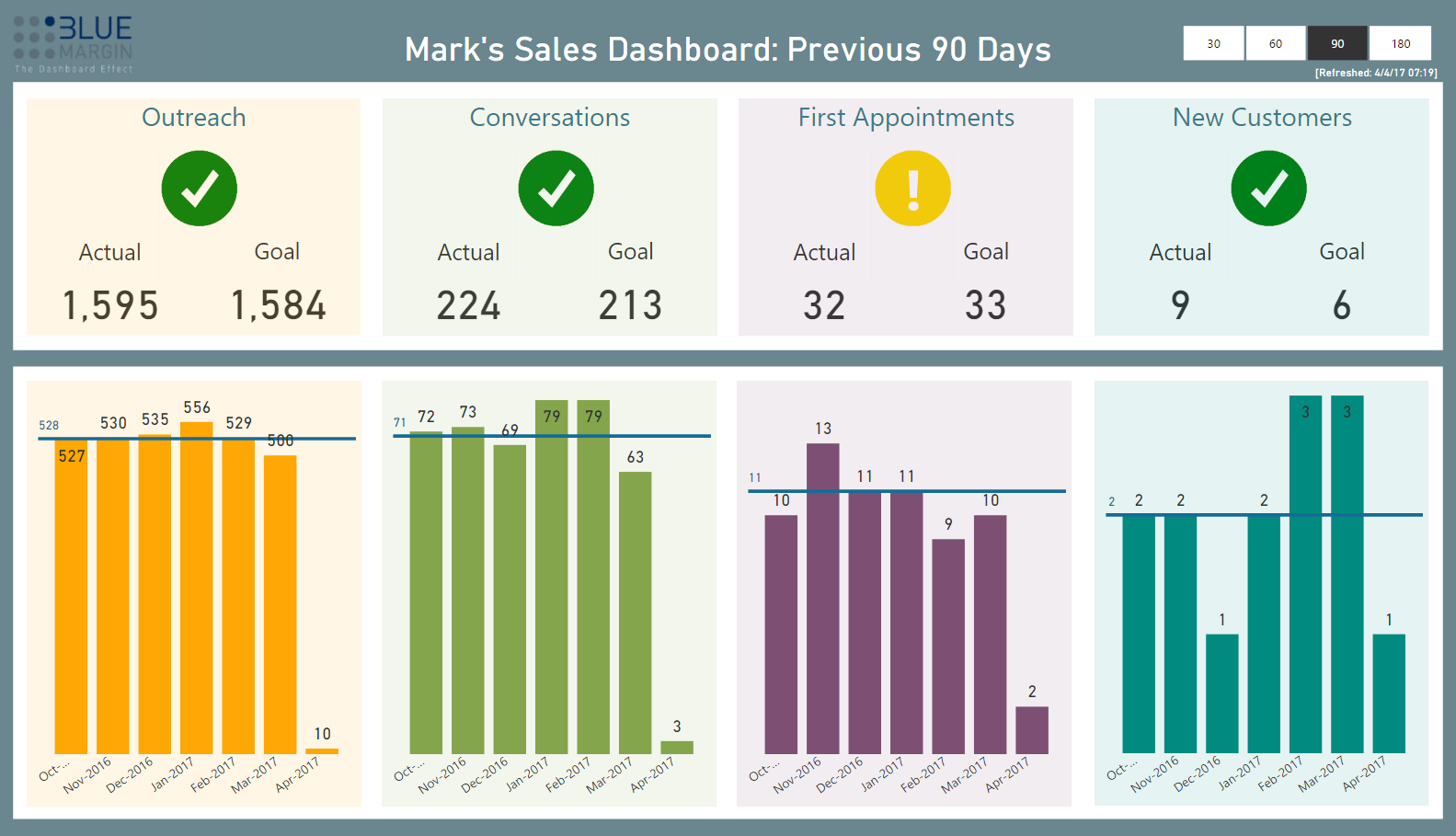
A reliable structure is to include three types of data visuals on each page: a high-level status indicator such as an overall RAG score, a trend view comparing current performance to a prior period, and a contextual breakdown such as aging receivables split by 30, 60, and 90-plus days. That sequence takes a user from awareness to analysis to the detail they need to act, reading naturally left to right and top to bottom. This is the same logic behind the employee performance dashboards we build to drive accountability at the team level.
3. Keep Design Consistent Across Every Report
Every dashboard in an organization should share a consistent structure and visual language, whether it is built for operations, finance, or sales. Refresh dates, drill-downs, and slicers should always appear in the same locations. Colors should carry meaning, not decoration. If green means good and red means bad in one report, those colors cannot mean something different in another.
Dashboards for engineers should be readable by marketers and accountants. If a report requires department-specific knowledge to interpret, it will only ever be used by that department, which limits its value as a shared management tool.
4. Apply Design Commandments, Not Just Instinct
Blue Margin maintains a standing list of dashboard design rules we call Commandments. They exist because intuition is an unreliable guide when it comes to what actually drives adoption, and having explicit standards keeps quality consistent across every engagement. A few of the ones we apply most consistently:
- Titles should be large, simple, and consistent across all reports.
- Minimize digits on the screen. If $1.9M communicates the point, do not show $1,912,543.
- Use graphics instead of raw numbers wherever Power BI supports it.
- Accompany critical metrics with icons so the purpose of each number is immediately clear.
- Do not use KPI status colors in non-KPI visuals. If green is good and red is bad in a scorecard, using those same colors in a bar chart with a different meaning creates confusion.
- Wrap drop-down slicers in a consistent color so users can distinguish them from other visuals at a glance.
- Default to a white or clean background. If using grey, avoid transparent backgrounds on visuals or the result gets muddy.
What Consistent Adoption Actually Produces
When the people in an organization check dashboards daily, something shifts. Visibility empowers people to manage their own performance rather than waiting for a manager to flag a problem. It creates a shared scoreboard, which changes how teams relate to their goals. We have seen this consistently across client engagements, and it is why adoption, not design sophistication, is the metric we track most closely on every project.
If your current dashboards are not getting the traction you expected, the design process is usually the right place to start. The managed data and analytics work we do always begins with adoption as the goal, not reporting as the deliverable. Talk to one of our experts to see how that approach applies to what your team is building.