
Better data doesn’t automatically lead to better decisions. Many organizations invest heavily in analytics tools only to find that their dashboards look impressive yet fail to create real change.
The difference comes down to design philosophy. At Blue Margin, we believe the purpose of a dashboard isn’t to present information; it’s to prompt action. Data only becomes valuable when it helps someone make a decision, solve a problem, or capture an opportunity.
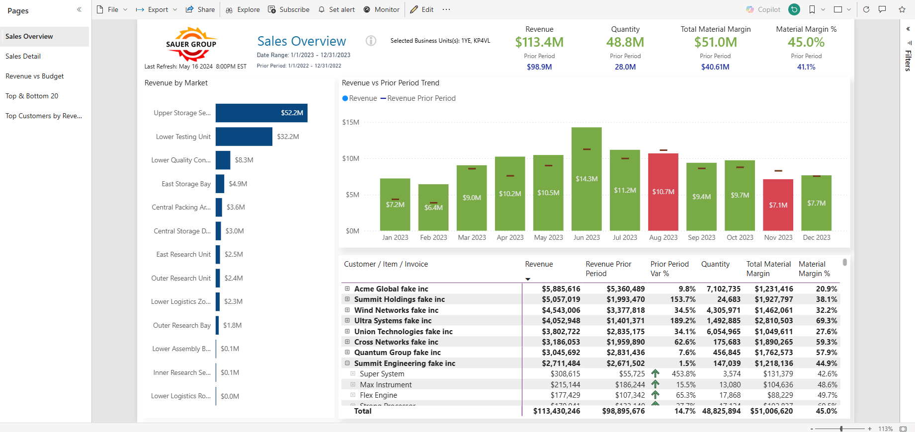
An effective dashboard starts with clarity. The most important KPIs should be front and center, showing instantly whether performance is on or off track. From there, users need an easy way to explore the “why” behind the numbers, drilling into trends by market, customer, or product. Conditional formatting, smart layouts, and intuitive drill paths all help direct attention to what actually needs it.
When dashboards are designed this way, teams spend less time hunting for answers and more time acting on them. Sales reps can prioritize the right accounts. Managers can identify which markets are lagging and why. Executives can see where performance is improving and where it’s not.
The goal isn’t to build prettier reports. It’s to give people the insight and focus they need to move the business forward.
If you’re looking to create clearer visibility into the drivers of performance in your business, but your team doesn’t have the time or tools to do it right, we can help. At Blue Margin, we specialize in building focused, high-impact dashboards that help leadership teams manage what matters most. Let’s talk.