If you’ve read a few of my articles, you know that I love to talk about business intelligence and embracing a data-driven
mindset. Still, you may be thinking, “That all sounds good in theory, but how can I apply it to my day-to-day business?”
Great question. To illustrate, I’ll describe how we apply the power of BI to our own company—and how it has made a marked
impact on our culture and productivity.
Our Problem
Blue Margin is a professional services company. As such, we’re a factory that produces billable hours. We have two goals for
those hours: each hour billed must deliver high value to our clients, and each high-value hour we produce must be billed.
It sounds simple, but as any professional services company will tell you, it can get complicated quickly.
How do you accurately track your time and make sure it doesn’t slip through the cracks? More importantly,
how do you ensure your people are staying busy and working on the right things? And how do you know whether you have enough
staff to do the work—or enough work to feed your staff? If you own or manage a company, these questions are probably
bouncing around in your head before your second cup of coffee on Monday morning.
Not surprisingly, we started by investing in a time-tracking tool. While it allowed us to enter and audit time for
invoicing and resource planning, it was still difficult to know when time wasn’t being recorded. After a day or two,
unrecorded time was simply lost. We couldn’t get a reliable, day-to-day view of consultant performance. We were
reactive—digging into the data only when something felt off—which
did not solve the root problem.
Our ad-hoc solution became constant, vague pressure on the team to stay on top of time entries. This wasn’t fun for anyone
and was ultimately counterproductive. We worried—reasonably—that we were delivering valuable work without billing for it,
effectively producing billable hours with no revenue.
We needed a way to see, at a moment’s notice, whether the train was on the tracks and heading in the right direction.
Our Dashboard Solution
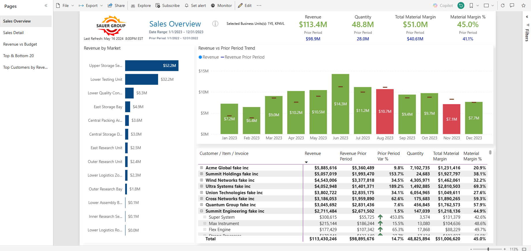
Here’s what we did. We built a dashboard on the homepage of our company portal (SharePoint, in our case) that shows the
performance of every employee—from the CEO down—covering billable hours, sales, and marketing. We wanted it to
tell a story visually and be so clear that even someone outside the company could understand how we were
doing at a glance.
By placing it on the homepage, it became the first thing employees see every day and the last thing they see before they
leave.
Download: Dashboard Design to Ensure Adoption (Whitepaper)
So, how are we doing this month?
Mostly greens, some yellows, and some reds. From that snapshot, we can tell we’re doing okay. Every employee can see how
their performance contributes to company goals. The result is
a clear visual of the company’s vitals.
Because of the self-accountability this creates, we no longer worry whether people are logging their time. When billable
hours are yellow or red, it simply means we’re low on work—and everyone knows it. Instead of anxiety and pressure, the team
understands the goal, whether it’s being met, and what’s required to succeed.
We’ve turned productivity into a sport—and this dashboard is our scoreboard. Instead of individuals battling uncertainty,
we’re a team fighting toward a shared goal: green.
Drowning in a Sea of Spreadsheets
In consulting, we see firsthand how a lack of visibility hurts decision-making. We recently met with a client committed to
being data-driven, yet after reviewing spreadsheets for 15 minutes, we still couldn’t tell how the company was performing.
The issue wasn’t a lack of data—it was the cost, time, and frustration of trying to extract insight from disconnected,
static spreadsheets.
The Buried Lead
BI dashboards work—but only when data is easy to collect,
visualized clearly, updated in real time, and highlights metrics that
“touch the nerve.” A spreadsheet can contain all the right numbers and still fail to communicate anything
meaningful.
Modern SaaS BI tools solve this. Once data connections are established, they persist. Automatically updated data is
displayed in intuitive visualizations that communicate insight instantly—without needing a data
scientist to interpret them.
If you’ve been working hard to make sense of your data but feel like you’re spinning your wheels, it may be time to explore
the new generation of BI tools.
If you’d like to learn how Blue Margin uses Power BI to run our own business,
contact us here.